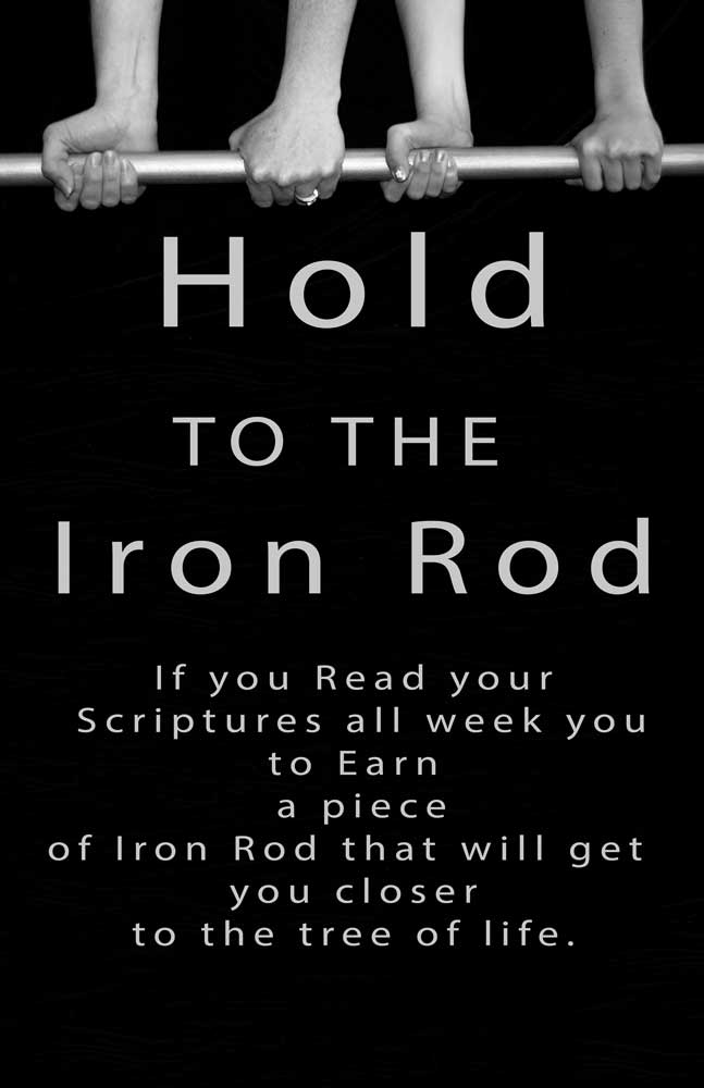
I had Fun creating this flyer for the LDS Seminary that I teach at. I made a dark wood grained back ground with I felt was simple but as I look at it it is hard to see wood gains. Also I was able to stamp majority of the photo in re-creating the wood grain for the bottom half. I choose a font that I felt would be simple but pop which I think it does. The more I look at the more I feel like that I need to not be afraid of space, I might be a too busy. I also made the photo black and white wanting to create deeper contrast.
